.

Creating a Stencil Bomb in Illustrator

Tuesday, 8 September 2009

http://vectortuts.s3.amazonaws.com/tuts/189_Stencil_Bomb/preview.jpgCreating a Stencil Bomb in Illustrator

Jul 22nd in Designing, Illustration by Cody Walker

There are many different ways to approach making a stencil. Some artists use Photoshop to create their stencils, but this method usually involves manipulating existing images.

For this tutorial, I'm going to start from scratch and go through the process of creating a graphic illustration intended to become a stencil, designing bridges into the illustration so it can be cut out with out losing any structure, And generally creating a design that works well as a large graphic image.

PG

Author: Cody Walker

I am a freelance illustrator working out of Toronto, Canada. I graduated from the Sheridan college illustration program specializing in technical and scientific illustration. I am very passionate about architectural illustration, and I really enjoy tackling projects using traditional media as well as digital. I feel that strong skills with fundamental tools like pen and paper, markers, and airbrush are essential even if the final product is a digital illustration.

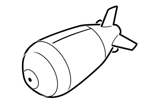
Final Stencil Preview

Below is the final stencil we will be working towards. Want access to the full Vector Source files and downloadable copies of every tutorial, including this one? Join Vector Plus for just 9$ a month.
Tutorial Details

  • Program: Adobe Illustrator
  • Version: CS4
  • Difficulty: Intermediate
  • Estimated Completion Time: 2 hours

Step 1 - Choosing a Good Subject

Clarity is a very important part of stencil art. Choosing a subject with a strong well-defined silhouette makes all the difference. For this tutorial I'm going to create a stylized image of the WW2 atomic (fat man) bomb.

Step 2 - Reference Photo

I started by getting a reference photo from Wikipedia.

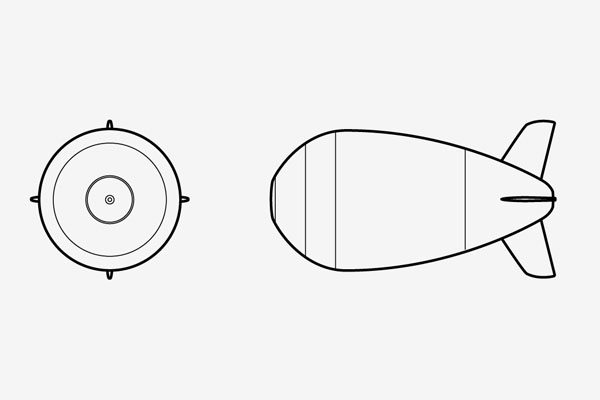
Step 3 - Quick Orthographics

From this image I created a quick set of orthographics. I needed a side view and a front view.
Step 4 - SSR

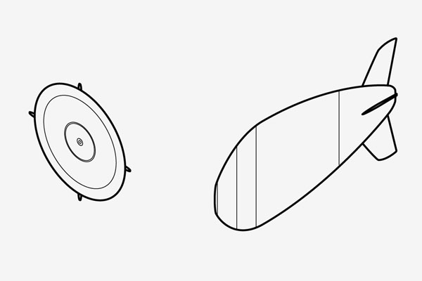
Using the method I discussed in the SSR tutorial, I scaled, sheared, and rotated my orthographics into isometric. I could make the stencil in perspective, but the setup would be more complicated, and I really like the results in isomeric.
Step 5 - Line Up

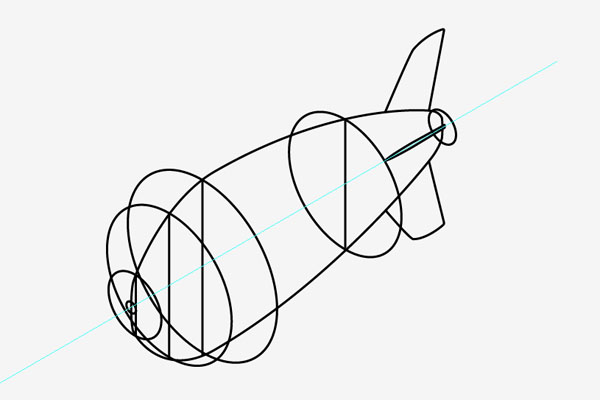
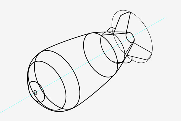
I use the side view of the bomb to line up the ellipses and created the wireframe of the bomb. Building the stabilizer fins can be a bit tricky, but if you use an ellipse for reference, you can keep them the same size and in line.
Step 6 - Clean Up the Shapes

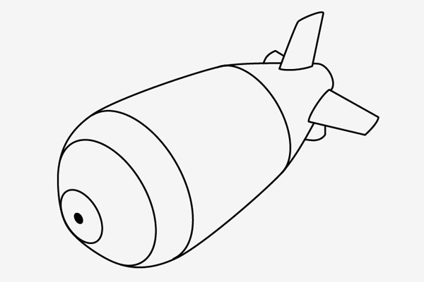
I started connecting and cleaning up the shapes. Removing the hidden lines and building up an outline.
Step 7 - Thick Outlines

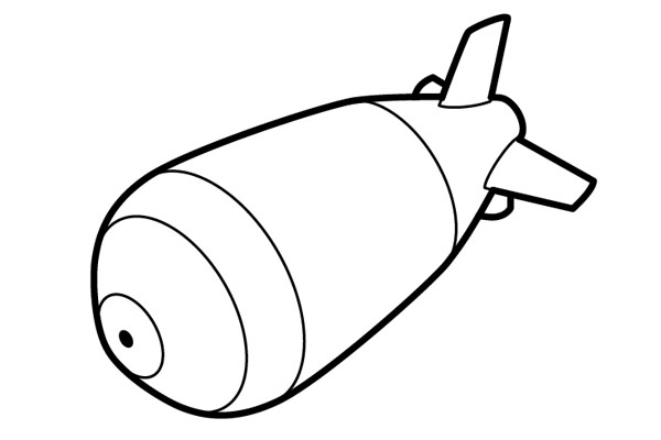
Now that the image is created the next focus is line quality. A big thick outline will give the stencil a clear visual impact and make your life a lot easier when it comes time to cut out the shapes.
Step 8 - Bridges and Islands

This is where a normal illustration becomes a stencil. Since you are cutting out the outlines, any open space that is not connected to the rest of the paper will fall out when you finish cutting (these are called islands). So to keep your inner structure you have to design in some bridges to give the inner elements structure. The tricky part about designing in bridges is to keep them as unobtrusive as possible. You don't want to ruin your silhouette by having a big break in it for no reason. So the best places to make bridges is at the connection points, at corners, or at overlaps.

To start this process select your illustration and go to Object > Expand. Expand both the fill and stroke. This will turn your lines into shapes so it's much easier to cut them apart and join them together. You can't go back to lines after you've expanded everything to shapes so before you start be sure to make a copy of your illustration on a separate layer and lock it.
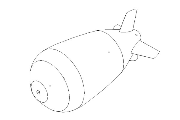
Below is the line work in outline view.
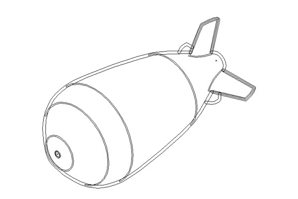
Below is the line work in outline view after being expanded.
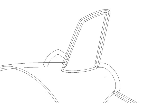
After expanding your lines use the Scissors and Pen Tools to clean up, then adjust the new shapes and build in bridges.
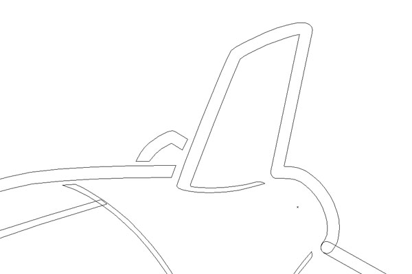
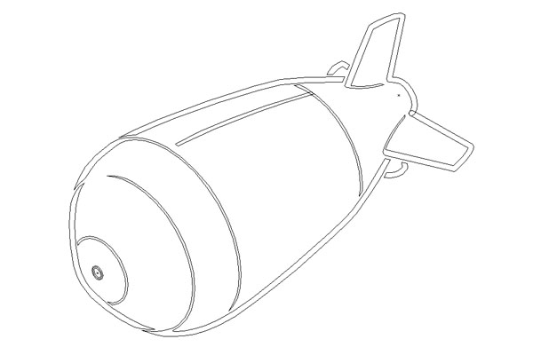
Below is the final image in outline view.
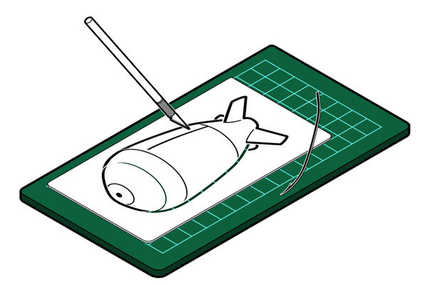
Step 9 - Print it, Cut it Out

You can make stencils out of lots of different materials. The thicker and stronger the material the longer your stencil will last, but the harder it will be to cut out. There are materials you can buy at art stores specifically for making stencils.
Step 10 - Spray it

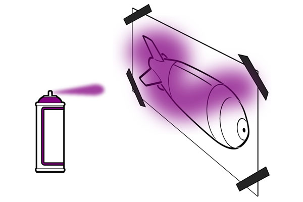
To get a nice clean images start by spraying the back of your image with a light dusting of spray adhesive. This will keep all parts of the image tight to the wall and hopefully stop any paint from getting in under the edges of your stencil.

There are lots of different ways to spray a stencil. Spray paint is the easiest but not always the best solution depending on the project. Airbrush works just as well, but with less fumes.

You can also print several copies of the same stencil and cut out different parts. Layering your paint with different stencils and different colors can lead to some really cool designs. A simple example of this would be to print off two copies of the stencil. The first cut out the entire images just leaving a silhouette of the bomb. The second stencil cut out the line work. This way you can use the silhouette to lay down a base color, then the line work for details, or off set the line work for a cool effect.

The nice thing about stencils is if you make them out of nice materials and take care of them, you can build up a library and use them for many projects.

Subscribe to the Vectortuts+ Feed to stay up to date with the latest vector tutorials and articles.
tutorials-designer illusstrator - photoshop - 3Dmax - Hudini - corelDRAW - VUE - Sketup - after effect

read more “Creating a Stencil Bomb in Illustrator”

How to Create Semi-Realistic Scissors in Illustrator

Scissors in Illustrator

Jul 23rd in Illustration by Kamen

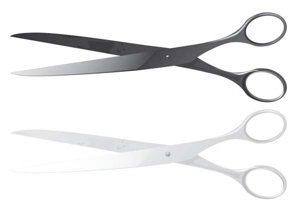
In this tutorial, we are going to create metallic scissors. I decided to create somewhat used and old looking scissors. We'll use some basic Illustrator tools, as well as simple shading and highlighting effects to create this illustration. Let's get started!

PG

Author: Kamen

My name is Kamen and I am a graphic designer from Varna, Bulgaria. My skills include Photoshop, Illustrator, InDesign, Premiere, Audition and Flash. In my free time I enjoy doing some digital and matte painting.

Final Image Preview

Below is the final image we will be working towards. Want access to the full Vector Source files and downloadable copies of every tutorial, including this one? Join Vector Plus for just 9$ a month.

13_final

Step 1

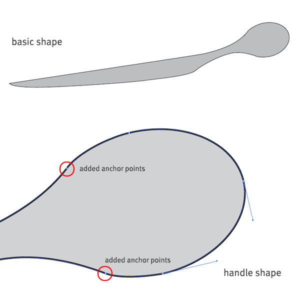
First, we'll divide the scissors in two parts. Select the Pen Tool and create a shape that resembles the first part of the scissors. Now fill it with gray and outline it with black.

For the handle, created an ellipse and rotate it a little. Make a copy of the ellipse and move it away for now. Use the Anchor Point Add Tool to add two points to the original ellipse. as shown below (depending on where you want the handle to start).

Delete the part of the ellipse that is not needed and join the anchor points with Object > Path > Join or Command + J. Tweak the handles of each point until you have a satisfying result.

Step 2

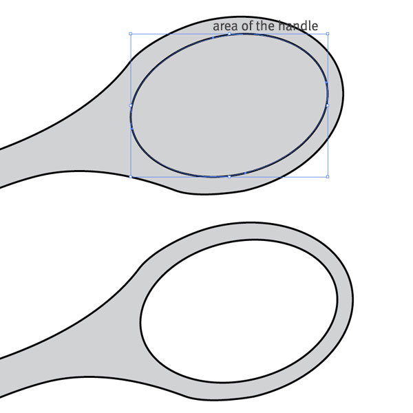
Select the ellipse copy and move it over the handle shape. Bring it to Front and scale it down until you have enough area for the metallic handle. Select both shapes, go to the Pathfinder panel and click Minus Front. Now we have finished part of the scissors.

Step 3

Duplicate the entire shape and reflect it horizontally. Send the copy to the back and adjust it accordingly. We have our basic scissors shape.

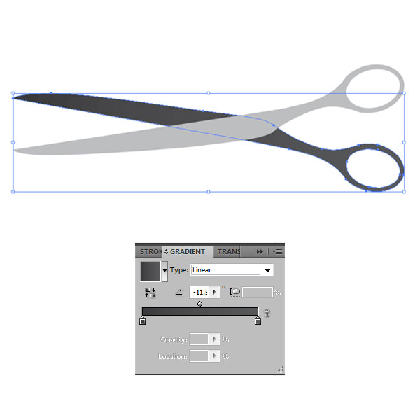
We have two options for coloring. We can either make it a silver metallic color or dark glossy metallic scissors. Let's do the second one. Let's go on and apply some gradients. Select the back shape and apply a linear gradient with the colors: K=90 at 0%, and K=80 at 100%. Rotate the gradient by -11.5 degrees.

Step 4

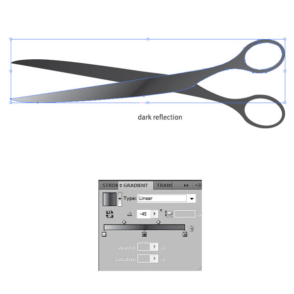
Repeat the process with the front part of the scissors. This time use three colors: K=20 at 0%, K=90 at 50% and K=70 at 100%. Bring the right gradient slider to location of 35% and set the whole gradient at -45 degrees. This will result in applying a really nice dark reflection effect in the middle of the front shape.

Step 5

When you take a look at aged and older scissors, you can see that little dots, spots, and irregular shapes of darker colors appear on the inner metal surface over time. Let's apply something like this to our scissors.

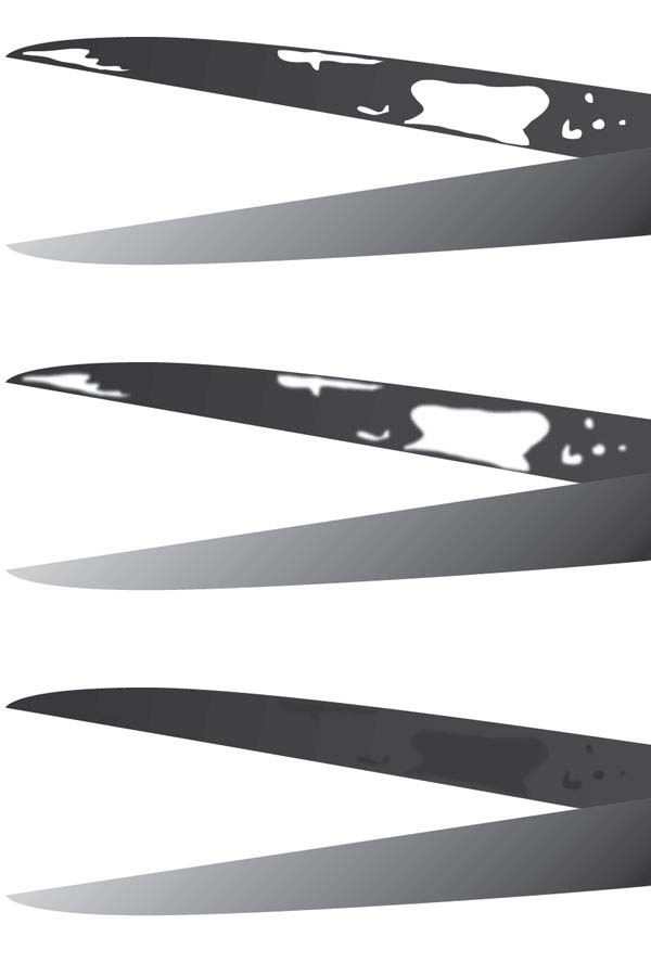
We are going to draw some shapes on the inner metal surface (the back shape) of our scissors. With the Pencil Tool draw some irregular, oval shapes. Use a white fill color to see them better. When done, select all of them and give them a Gaussian Blue of 3 pixels, or give each shape different blur settings.

Finally, select all shapes and change the fill color to K=90 and also lower the opacity of some of them to achieve a bit of variety. Keep in mind that the older the scissors get, the more particles will collect on the surface. If you're going to create a really aged look, repeat the process and create more irregular shapes.

Step 6

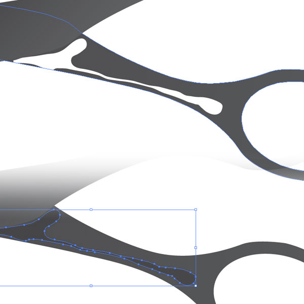
Let's make a similar shape closer to the handle. This time I made a something that resembles dark reflection, smaller by the handle and bigger in the other end. Again, fill it with K=90, give it a Gaussian Blur of 3, and set the Opacity to 70%.

Step 7

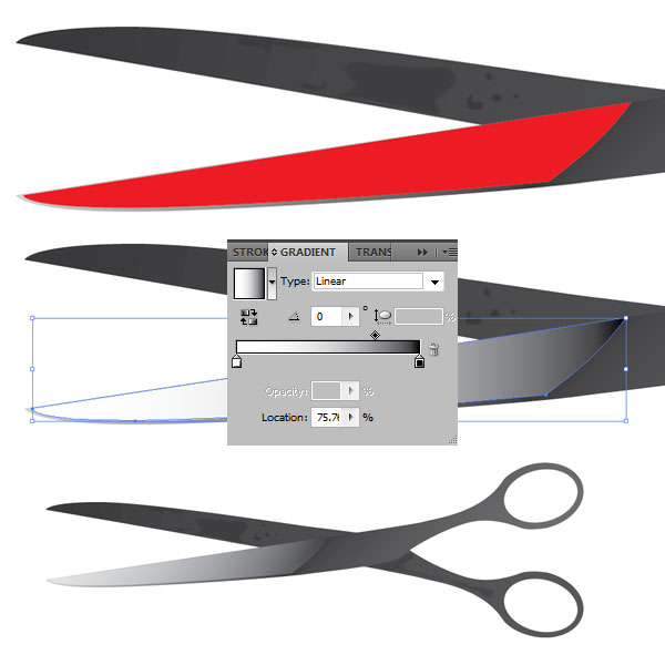
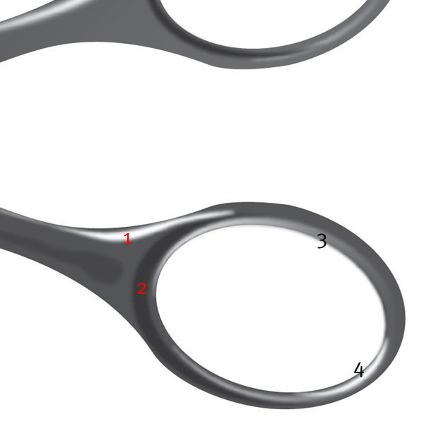
Since we are going for a semi-realistic illustration, our scissors still feel too flat. Let's add a big highlight to the front shape. Use the Pen Tool and following the edges of the scissors, draw a shape similar to the image below.

Give the shape no stroke and a white to black linear gradient. Be sure to drag the gradient slider to 75%. Next, set the shape to Screen blending mode and lower the Opacity to 50%. This will give us a nice metallic highlight with a hard edge and will blend well with the entire shape.

Step 8

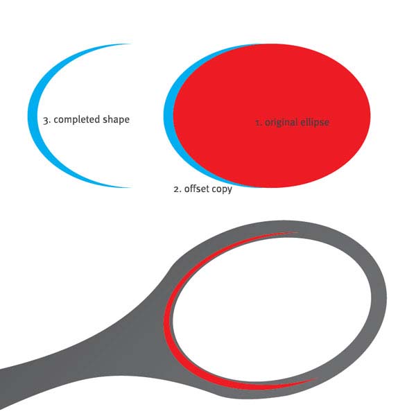
It is time to give a similar treatment to the handles. We have to create some dark and light reflections. Let's start with the back shape's handle. If you are experienced with the Pen Tool, you can proceed and make a crescent shapes.

If you're not, you can use the Pathfinder tools instead. Create an ellipse, make a copy, and offset it to the left. Select both shapes, click either Minus Front on Minus Back, depending on where your copy is. In my case, my copy (the one I wanted to keep) was in the back, so I used Minus Front.

Step 9

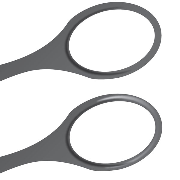
Proceed with the reflections. Use the same technique to create more crescent shapes. In my case, I made one more because I'm not going into too much detail.

Select the first reflection, fill it with K=90 and give it a Gaussian Blur of 3 pixels. Place the second shape opposite the first one - this is going to be a light reflection. Fill it with a white to black linear gradient, apply a Gaussian Blur of 3 pixels. Finally, set it to Screen blending mode. This will make the black part of the gradient fully transparent.

Step 10

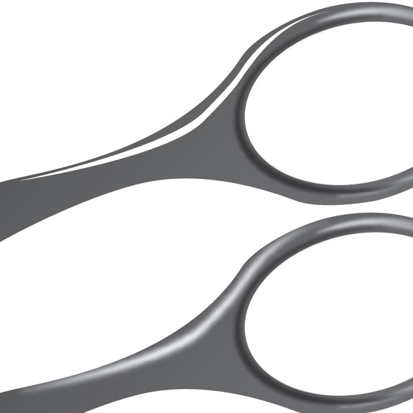
We need one more bright highlight in the handle. This time we are going to stretch it from the middle of the handle far to the left lower part. Grab the Pen Tool, and make a shape following the outer edges of the scissors.

Fill with white and no stroke. Give the shape a Gaussian Blur of 5 pixels. Leave the blending mode to Normal and Opacity at 100%. If you are using a reference image, you can continue adding dark and bright reflections, shadows, and highlights until you are satisfied with the look of the handle. I'm doing this without any reference, so I'm going to leave it here.

Step 11

Using the same process from Steps 8, 9 and 10, create reflections for the other handle. You can always duplicate your reflections and flip them horizontally, but I would advise against that.

The way metal reflects light is unique and the reflections depend on what time of the day it is, the viewing angle, the available light source and so on. That's why I made four new reflections for the other handle.

Step 12

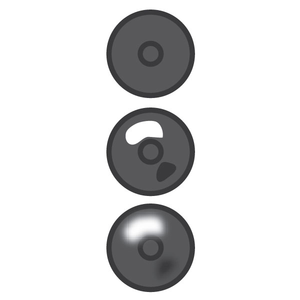
We are almost done. The last thing we need is the small screw that holds both parts of the scissors. Create a circle and set the fill color to K=80 and stroke color of K=90. Create a smaller circle and place it on the middle of the big one. Give it only stroke color of K=90.

Next, create two small irregular shapes with the Pencil Tool. Fill one with white and the other with K=90. Select them both and give them a Gaussian Blur of 2 pixels. Group the whole screw and place it in the middle of the scissors, see final image for placement.

Conclusion

The illustration is finished and we have a semi-realistic scissors. The whole image took me a little under 30 minutes to make, and once I decided on color it was fairly easy to do it.

If you like to do silver metallic scissors, change all the dark gray colors of the image with lighter ones. For example, if your dark gray value is K=90, change it to K=10, K=80 change to K=20 and so on. Additionally, you can create plastic handles for the scissors. I hope you enjoyed this tutorial and have fun applying these techniques in your own illustrations!

Subscribe to the Vectortuts to stay up to date with the latest vector tutorials and articles.

tutorials-designer illusstrator - photoshop - 3Dmax - Hudini - corelDRAW - VUE - Sketup - after effect

read more “How to Create Semi-Realistic Scissors in Illustrator”

3D Logo

3D Logo

3d logo This tutorial will show you how to make 3D gradient logo in minutes. This technique is great for making 3D graphic objects and icons.


tutorials-designer illusstrator - photoshop - 3Dmax - Hudini - corelDRAW - VUE - Sketup - after effect

Version: Illustrator CS2

Download Source File

1. 3D text

Use the Type tool, type in "3D Logo". Go to Effect >Warp > Arc and apply the following setting:

warp text

2. 3D Extrude & Bevel

Then go to Effect > 3D > Extrude & Bevel and apply the setting as shown in the image below. You can drag around the cube to set the X,Y,Z rotation values. Set the Extrude Depth to 20pt.

3d extrude & bevel

3. Expand Appearance

Now go to Object > Expand Appearance to remove all effects and convert to paths. After the text object is expanded, Ungrounp the object by Object > Ungroup or press Ctrl+Shift+G. You probably need to do Ungroup 4-5 times in order to break the object apart.

expand appearance

4. Merge paths

Select the round corner paths and merge them together by the Pathfinder tool. Hold down Alt key, click on the Add to shape area and the selected paths will be merged. Repeat this step to clean up all round corner paths.

pathfinder

5. Apply gradient

Select the top level paths and apply a yellow-green color gradient.

gradient

6. Eyedropper

Select the back(depth) paths, use the Eyedropper tool and click on the front paths. This will copy the gradient fill.

eyedropper

7. Darken

Keep the back paths selected, go to Gradient pallete and adjust the gradient colors to darker tone.

darker gradient

8. 3D logo

You can use this technique to make 3D objects from any shape, text, etc.

Here are the steps:

  1. Apply 3D Extrude & Bevel effect
  2. Expand object
  3. Ungroup object
  4. Apply gradient
  5. Eyedropper gradient fill

3d logo

More…

Here are more samples I made using the same technique.

more 3d logo

read more “3D Logo”

Halloween Pumpkin


adobe bridge Let’s have some fun. Learn how to draw a realistic Halloween pumpkin in Illustrator so you can attach to your ecard or email.

Version: Illustrator 9+

Download Source File

1. Basic shapes

First, use the Pen tool and draw the basic shapes of the pumpkin.

1

2. Fill Gradient

Fill the shapes with a linear gradient with no stroke fill. Gradient color1: R=255 G=127 B=0, color2: R=255 G=127 B=0

2

3. Shading

Select all shapes, go to menu Edit > Copy (Ctrl+C). Then go to menu Edit > Paste in Front (Ctrl+F) to paste in position.

3

With the shapes remain selected, open Pathfinder palette (Window > Pathfinder). Hold down Alt key, click on Add to shape area. This will merge shapes together.

4

Select the following gradient setting - color1: R=255 G=255 B=255, color2: R=204 G=122 B=22. Slide the white picker toward the right side. With the merged shape remain selected, drag from the upper center toward bottom.

5

Change the Blending Mode of the merged shape to Multiply.

6

4. Stem

Use the Pen tool and draw a shape of stem on top of the pumpkin. Fill it with a radial gradient as shown. Gradient color1: R=111 G=129 B=46, color2: R=82 G=56 B=17.

7

5. Cutout Face

Make a new layer on top of the pumpkin. Use the Pen tool and draw the basic shapes of the face. Select all the shapes (face only), use the Gradient tool and fill it with a radial gradient as shown. Gradient color1: R=255 G=242 B=0, color2: R=255 G=146 B=0, color3: R=187 G=50 B=0.

8

6. Depth

Now, we need to add some depth to the pumpkin cutouts. Use the Pen tool, roughly draw a shape intersect with the left eye cutout. Then Copy the left eye and Paste in Front. Select the left eye shape and the intersect shape, go to Pathfinder, hold down Alt key and click on Intersect shape areas.

9

Repeat this step until you get all the features done (eyes, nose, and mouth).

10

7. Shadow & Highligh

Fill the shadow area with a darker gradient (color1: R=255 G=146 B=0, color2: R=187 G=50 B=0). Then fill the highlight area with a lighter gradient (color1: R=255 G=255 B=139, color2: R=255 G=164 B=0).

11

Final

That’s it!

12


tutorials-designer illusstrator - photoshop - 3Dmax - Hudini - corelDRAW - VUE - Sketup - after effect
read more “Halloween Pumpkin”